COLOUR MEETS QUIET SPACES
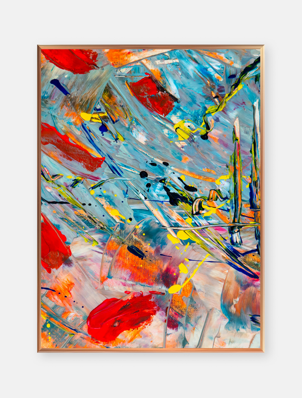
A quiet room can still have a bold point of view. In the space pictured here, a large abstract artwork brings vivid orange, turquoise, red, and purple into a setting of soft grey walls, pale flooring, and simple furniture. The result feels lively without becoming crowded.
The painting’s sweeping marks give the eye somewhere to travel. Bright orange stretches across the upper portion, while cooler turquoise and deeper accents gather below. Pale areas between the colours leave room to breathe, balancing energy with a sense of openness.
That balance continues beyond the frame. A low wooden console creates a grounded horizontal line beneath the artwork, while the curved grey chair softens the arrangement. A dark red floor vase and warm-toned stems pick up the painting’s warmer notes without repeating its entire palette.
To bring a similar feeling into your own space, start with one artwork you enjoy looking at. Let it lead the colour choices rather than trying to match every piece of furniture. One or two small accents drawn from the artwork can make the room feel connected while leaving its character intact.
Scale matters as much as colour. A generous piece can give a simple wall a clear focal point, especially when nearby furnishings stay visually understated. Before hanging, mark out the frame’s dimensions on the wall and check the arrangement from both the doorway and your usual seating position.
Notice how daylight becomes part of the composition, too. Here, soft shadows stretch across the wall and floor, adding movement around the still artwork. When choosing a position, consider changing light and avoid prolonged direct sunlight that may affect sensitive colours or materials.
A restful interior doesn’t have to be colourless. With a little space around it and a few thoughtful connections, expressive abstract art can bring warmth and personality to a room while preserving its sense of calm.
THE ART JOURNAL
Discover art stories, creative insights, artist spotlights, and tips that bring the beauty of art closer to you.

Explore the dialogue between bold abstract paintings, sculptural forms, and open space, with ideas for looking at art and displaying it at home.

A reflection on portrait painting, creative curiosity, and making space for the small moments that bring art to life.

Bold abstract colour meets a calm interior, with simple styling ideas for balancing statement art, neutral furniture, and thoughtful accents.

Discover how an expressive portrait, bold colour, and contrasting textures can bring personality to your space.

Explore how rich wood grain, geometric shapes, and warm tones can turn a simple wall into a thoughtful focal point.

A playful animal portrait shows how expressive colour and a little whimsy can bring personality to your space.